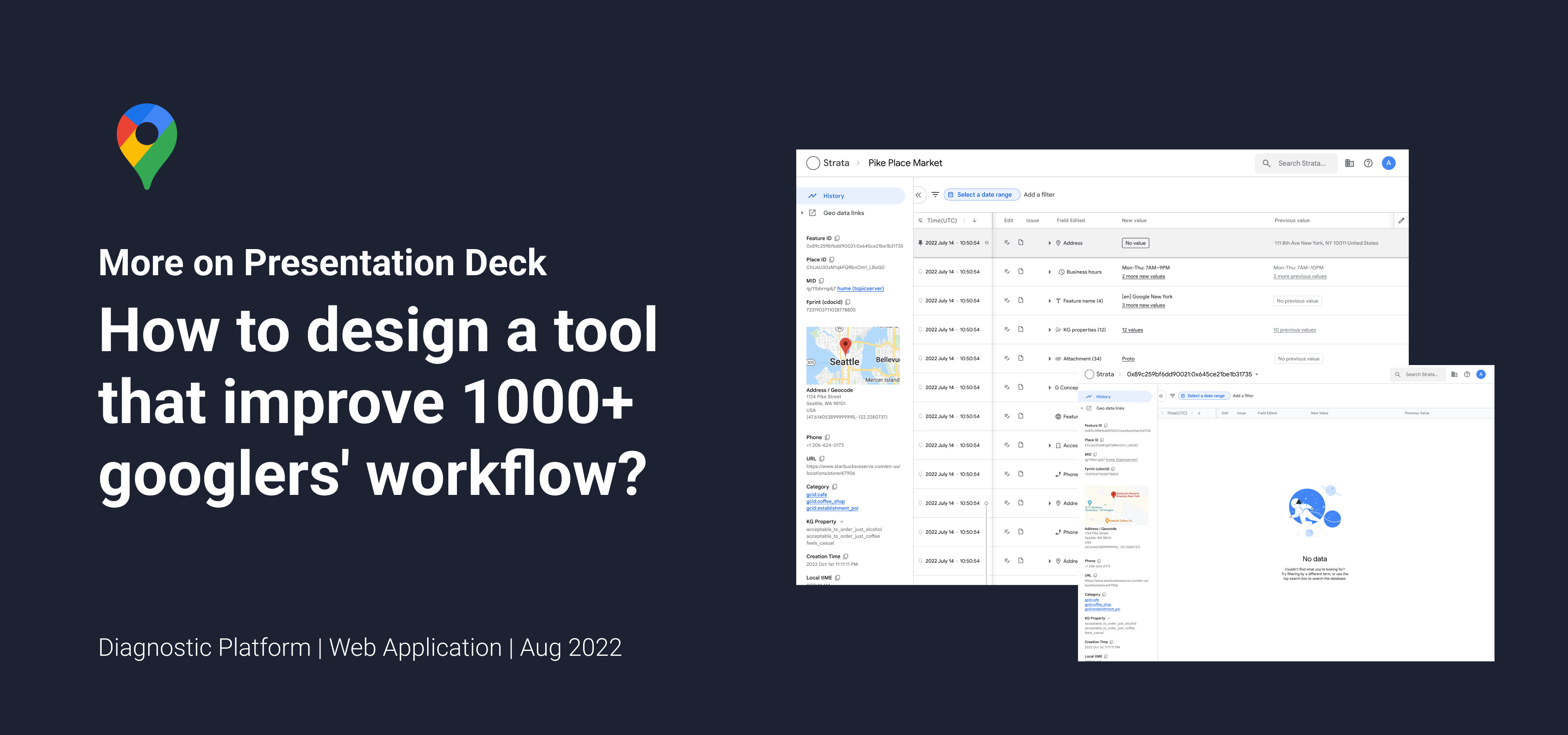
Let's meet, Strata.
Strata is the new diagnostic web app platform that is composed of focused ''Mini-Apps' for accomplishing diagnostic tasks. In another word, it is an advanced database dashboard that allows users to access and analyze both geological and human activities data. Currently, the Pelorus engineer team works closely with our UX team on building the MVP product of Strata.
The goal of this new product is to help accelerate bug processing speed for thousands of geo data operators and google engineers around the world.
My Role
I have been working on Strata for 4 months now, and my responsibilities include UX features redesign, user journey mapping, user research through shadowing, usability testing, and component library creation.
Our team is made up of 15 members with 10 engineers, 1 UX researcher, 1 UX writer, 1 product manager, and 2 UXD. We collaborate closely on every design stage.
Unique Challenges
1.
One of the biggest challenges I am facing when designing Strata is the complexity of the customer needs.
There are 3 major user groups of Strata:
(1) Product managers who need to confirm map auto updates and changes, (2) Operators who need to access historical geo data and verify changes, (3) Engineers who need basemap data while modifying the map.
Moreover, there are multiple unique user flows within each user group. Therefore, at the preliminary research stage, we have identified more than 8 different workflows.
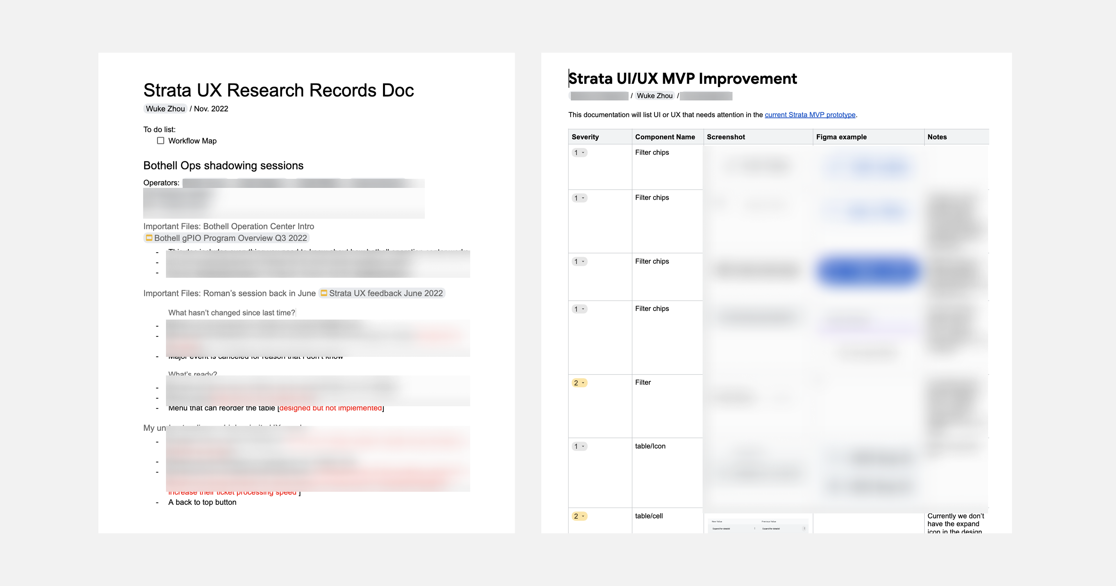
To solve the challenge, we need to understand the users via their daily routines. I have participated in 4 on-site shadowing sessions at the Google operation center as well as dozens of online shadowing sessions with engineers and operators from Dublin, India, and New York. After that, I wrote docs/presentations that reflect user needs that I learned from these sessions, which includes a research summary, a user painpoints list, and a user journey map.
2.
The other challenge here is how to design a dashboard interface that contains such massive and various geo data while adopting a modernized google material design system. Since the old platform has existed for more than 10 years without any upgrades on UI, we need to think about not only modernizing the look but also helping the users to onboard the application fast.
After countless design sync with the tech team and shadowing sessions, the problem will be conquered in two steps.
Firstly, we will utilize every space we have on the screen and try to focus on information prioritization. My responsibility here is to understand the priority of data and then create the simplest UX flow for the user to access the data.
Secondly, we use different interactions and shortcuts such as extra help text to hint to the users about the meaning of the content and how to use the software. In order to do so, I designed different hover cards, tooltips, error messages, and other interactive components that help provide more context within the application.
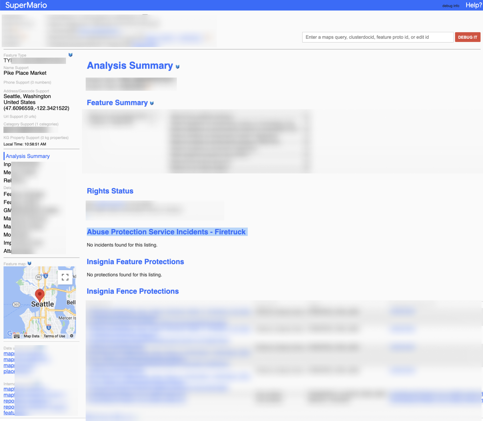
An UI example of the old diagnostic platform
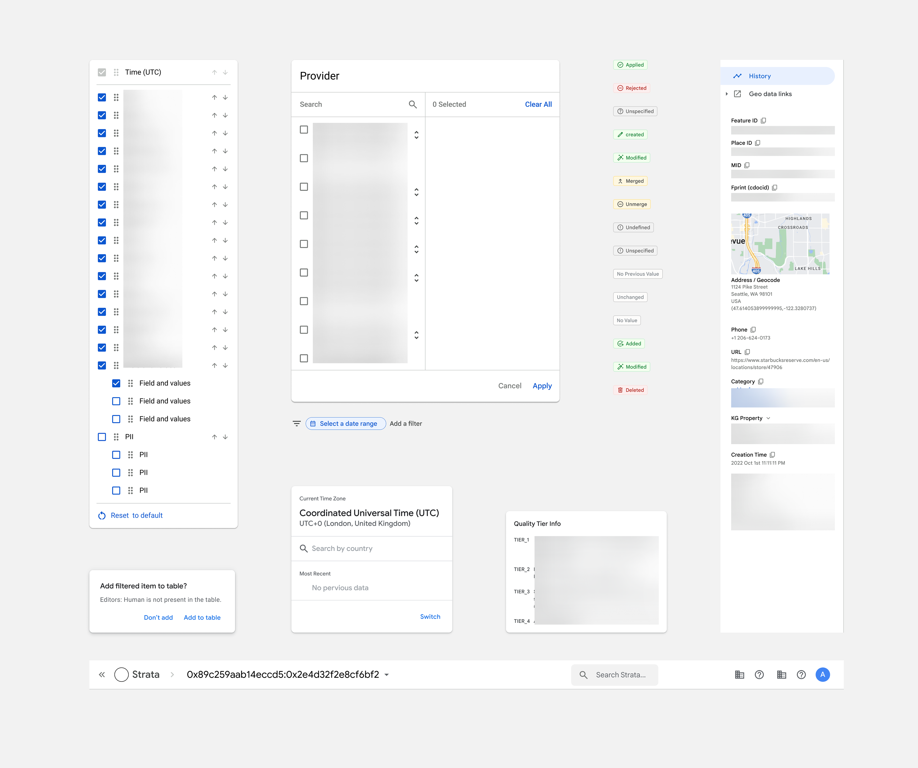
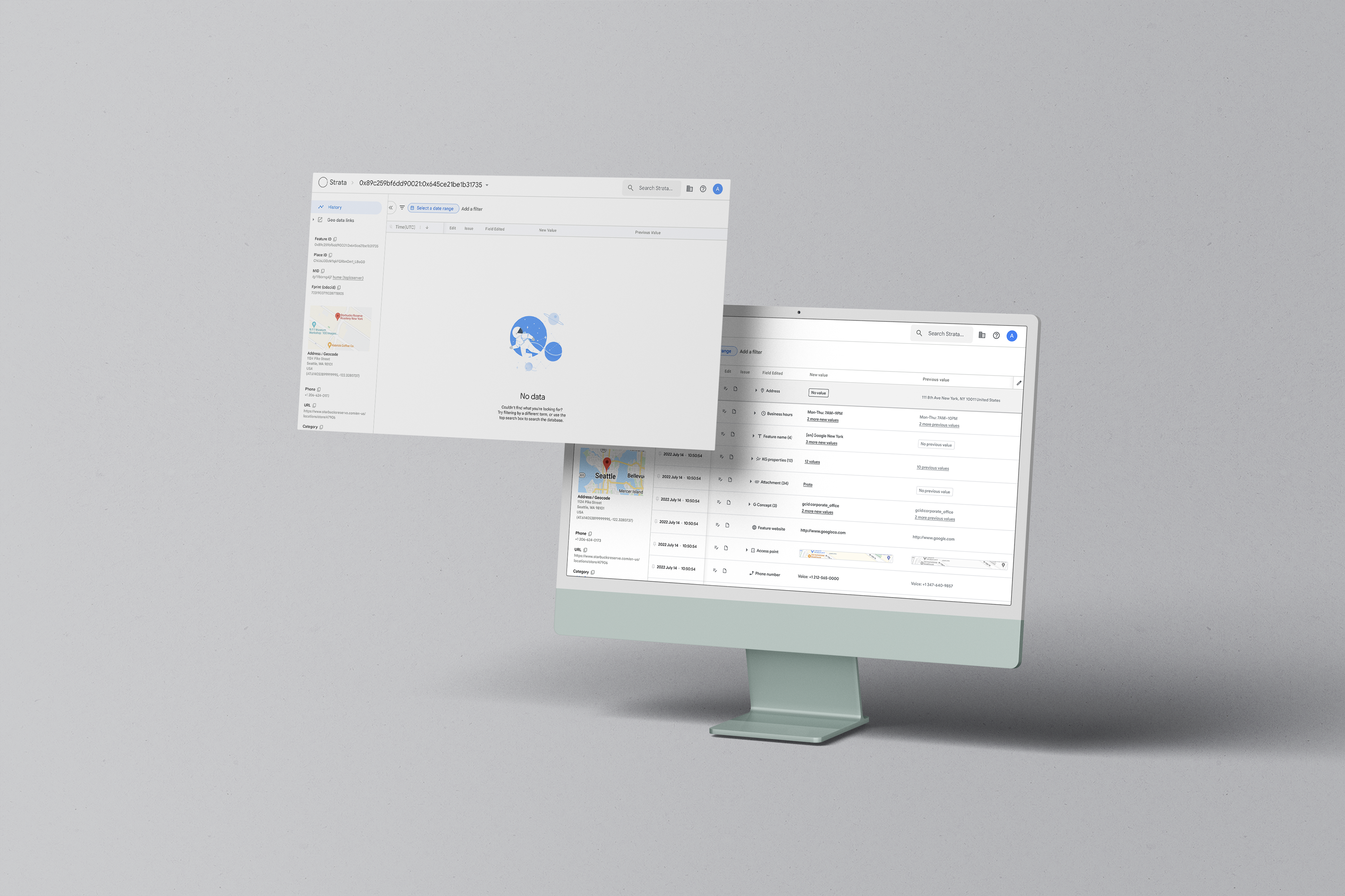
New interactive components that applied GM2
While I can’t disclose more details of my project due to the NDA, feel free to contact me if you would like to learn more from my presentation deck!


